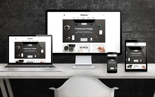
In today’s digital world where your business website serves as your most visible business card, you need a well-polished, professional, and credible site to attract potential clients. Imagine your official business website as a physical store where your existing and potential clients visit to choose your products and services over your competitors.
Although different people prefer different styles, it doesn’t mean that there aren’t ground rules that you need to follow to make your business website look professional. It doesn’t matter whether you are using a free site maker tool; or working with a professional web developer, here are some essential tips that you need to follow to make your website look professional.

Keep Your Homepage Clutter-Free and Well-Organized
Visitors to your business website rarely read every word on your site. Instead, they quickly scan through the homepage picking out some crucial keywords and sentences. With this in mind, it is always critical to appeal to emotions other than focus on word count. The less someone visiting your website has to click on, read, or remember, the better they will be able to process and evaluate what is going on in front of them.
This will increase the chances of the visitors doing what you wanted them to do in the first place. While text and call to actions are necessary, it is essential to break them up with larger subheadings and short paragraphs. You can also use images and icons as alternative means of communicating with your site visitors.
Good Typography
You should also keep in mind that having the right set of fonts is crucial to making your web content readable and more presentable to your visitors. The good news is that you don’t have to spend money buying the right fonts since they are available at the Google Fonts page. When searching for the right font, make sure that your specific language subset is included.
Fortunately, if you are working with a professional web development company, such issues might not be a big problem for you. If you are doing it yourself, let Google help you choose the right fonts for your website.
Use Professional Images
Images usually play the most significant role in making a good first impression. Good and professional images can instantly attract users and make them curious. The best pictures to use on your business website are those that were taken by a professional photographer and prepared by your trusted professional graphic design service to suit your unique business needs.
However, if you can’t afford such images, then you can find free alternatives online. While picking a photo to use online, always pick that photograph that grabs your attention fast. Use of professional images is particularly important if you want to repost your blog article or a certain web page to social media such as Twitter, LinkedIn, or Facebook since it will make your post stand out.
Minimize the Loading Time
It doesn’t matter how professional your site looks but if a visitor needs to wait 15 seconds for a page to load, then you have lost it already. Statistics show that the longer your web pages take to load, the higher the page abandonment rate. You should also keep in mind that slow loading times will negatively affect your Google search rankings.
Your loading time is usually affected by the page design and the programming. Some of the simple ways of improving your page loading times include reducing the number of redirects and optimizing your images and code.
Think Mobile
We are living in a mobile society, and the truth is that more than 60% of the people who will be visiting your website will be doing so on a mobile phone or tablet. Today, mobile phone web traffic has already surpassed desktop web traffic, and it is still growing.
Therefore, for website owners, optimizing it for mobile devices is crucial. Ask yourself what your visitors see when they access your site on their smartphones and tablets. Make sure that you have a mobile-friendly version of your site to keep pace with the ever-growing mobile world.
